USE COLOUR IN YOUR MOVIE
Colour in Storytelling
Colour is an important part of the filmmaker’s toolkit. You can use it for mood and emotion, to tell the audience when the scene is set, or to provide information about characters and settings.
You can use colour by:
- featuring specific colours in your props, costumes or settings
- choosing lighting with the colour balance you want
- correcting and ‘grading’ the colour at the editing stage

Wes Anderson movies like The Grand Budapest Hotel use bright, distinctive colour palettes for locations and costumes.

Danish/Swedish noir drama The Bridge uses unhealthy, washed-out colours to match its grim subject matter. It’s achieved through the choice of costumes, props and settings, and by grading the images for a consistent bluish-green look.
Colour meanings
Colours have different meanings depending on context.


In Stanley Kubrick’s 2001: A Space Odyssey red means danger, but in Richard Ayoade’s Submarine Jordana’s red coat means passion.
Blue: can mean technology or alienation, but it can also suggest winter or night. Also peace, tranquility, cold, harmony, cleanliness, sky and water.
Violet: Royalty, nobility, spirituality, mystery, floral and wisdom.
Red: Emotion, desire, energy, heat, intensity and passion.
Orange: Energy, balance, enthusiasm, warmth and vitality. Orange and warm colours usually suggest autumn, nostalgia or sunset.
Yellow: Joy, happiness, optimism, sun and friendship.
Green: Nature, environment, health, luck, renewal and fertility.
Cold: relaxing colors like the blues.
Warm: Exciting colors, such as reds, oranges and yellows.
Mixed: Colors with a fresh and warm meaning, such as violet and green.
Neutral: The unification of earthy colors, such as brown, gray, black and white.
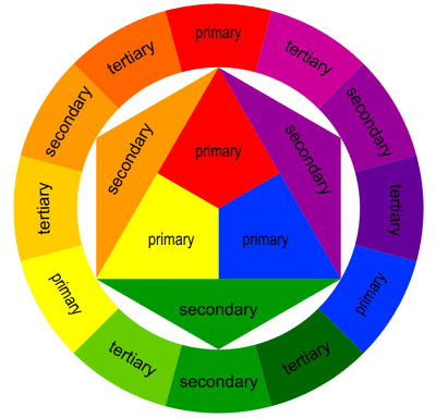
Harmonization: The colors that appear next to each other in the color wheel or color circle and work well together.
Contrasting: Colors separated by other colors in the color wheel.
Accessories: Colors at opposite ends of the color wheel that often collide
Colour intensity is important:
- Strong, saturated colours seem hyper-real or cartoonish
- Weak colours can suggest poverty or depression.
You can also use monochrome images.
Brown or sepia makes people think of old photographs, so you can use it to show that part of your film is a flashback.
Black and white can show that a scene is in the past or in a character’s imagination or memory.
Colour balance
You could choose to film with lighting that has a particular colour balance. Some filmmakers choose to shoot in the golden hour after dawn or before sunset, or the blue hour at dawn or dusk.
For quick and dirty colour casts, you can deliberately set your camera to the wrong white balance. For a blue hue, set your camera’s white balance to ‘tungsten’ when you’re filming outdoors; for a warm tone, film under tungsten light with the balance set to daylight.
But it’s better to shoot with a natural/neutral colour balance and adjust the colour afterwards.
To get the colour balance right when you’re filming, use a colour meter or set the white balance manually. With most cameras, you can do this by using a white card.
Correction and grading
You can adjust and correct colour at the editing stage.
Start by getting the exposure and contrast right, then adjust the saturation, before adjusting the hue or tint.
Once you’ve corrected the colour, you can ‘grade’ the clips: making adjustments so that clips shot at different times match each other, or applying an overall ‘look’ to change the mood.
Comments
Post a Comment